Cinchère came to BAES with a vision but not yet a brand. They knew they wanted to open a luxury body sculpting studio in Scottsdale, one that could stand apart in an increasingly crowded market, but didn't have a name, an identity, or a strategy to bring that vision to life.
Cinchère came to BAES with a vision but not yet a brand. They knew they wanted to open a luxury body sculpting studio in Scottsdale, one that could stand apart in an increasingly crowded market, but didn’t have a name, an identity, or a strategy to bring that vision to life.
Cinchère came to BAES with a vision but not yet a brand. They knew they wanted to open a luxury body sculpting studio in Scottsdale, one that could stand apart in an increasingly crowded market, but didn't have a name, an identity, or a strategy to bring that vision to life.


That's where our work began. We started with naming, developing Cinchère: a name rooted in the cinch of a corset, the ultimate symbol of contouring and transformation, with a French-inflected spelling that gives it a couture, bridal feel for the brides who make up the studio's core audience.
That’s where our work began. We started with naming, developing Cinchère: a name rooted in the cinch of a corset, the ultimate symbol of contouring and transformation, with a French-inflected spelling that gives it a couture, bridal feel for the brides who make up the studio’s core audience.
That's where our work began. We started with naming, developing Cinchère: a name rooted in the cinch of a corset, the ultimate symbol of contouring and transformation, with a French-inflected spelling that gives it a couture, bridal feel for the brides who make up the studio's core audience.


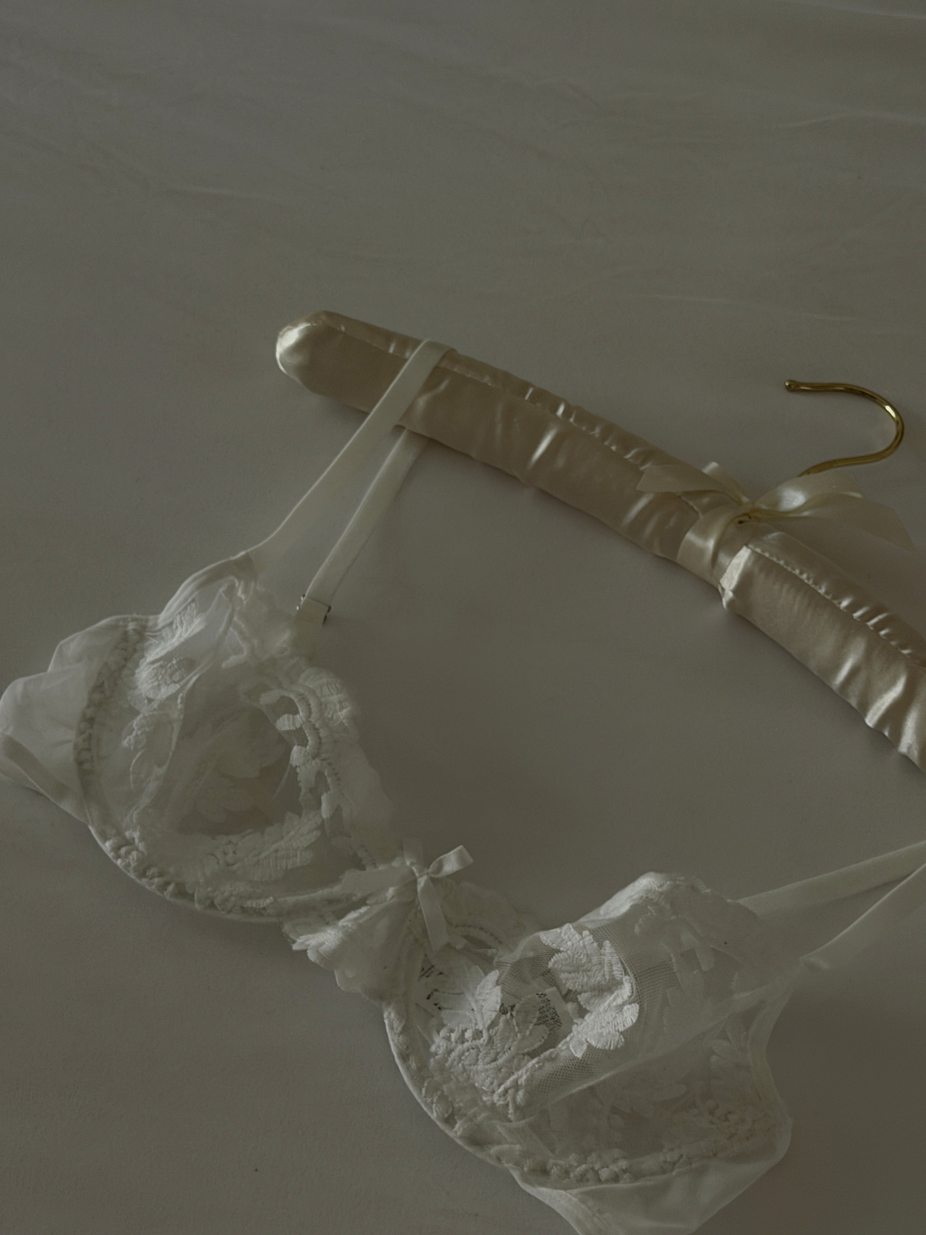
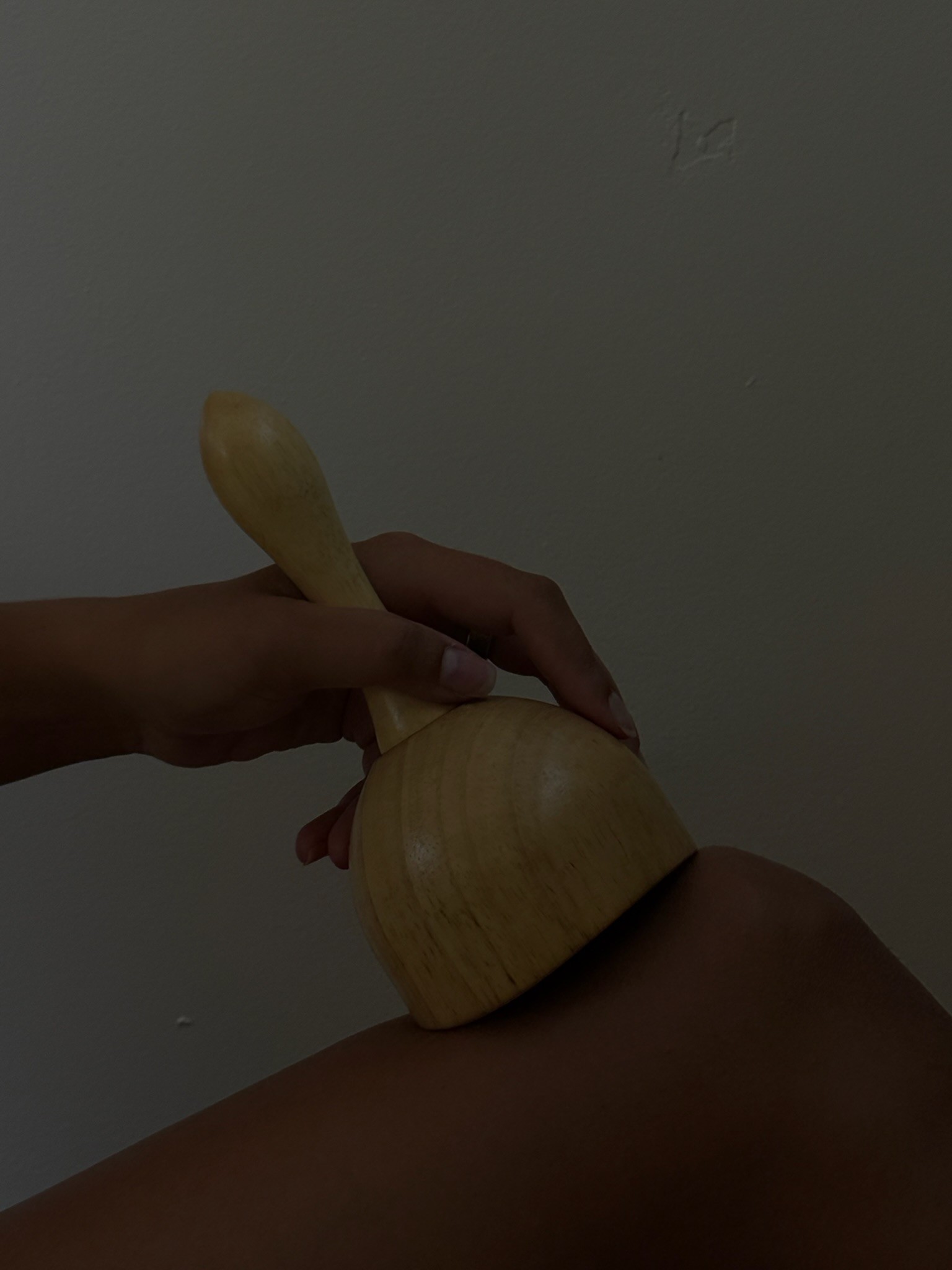
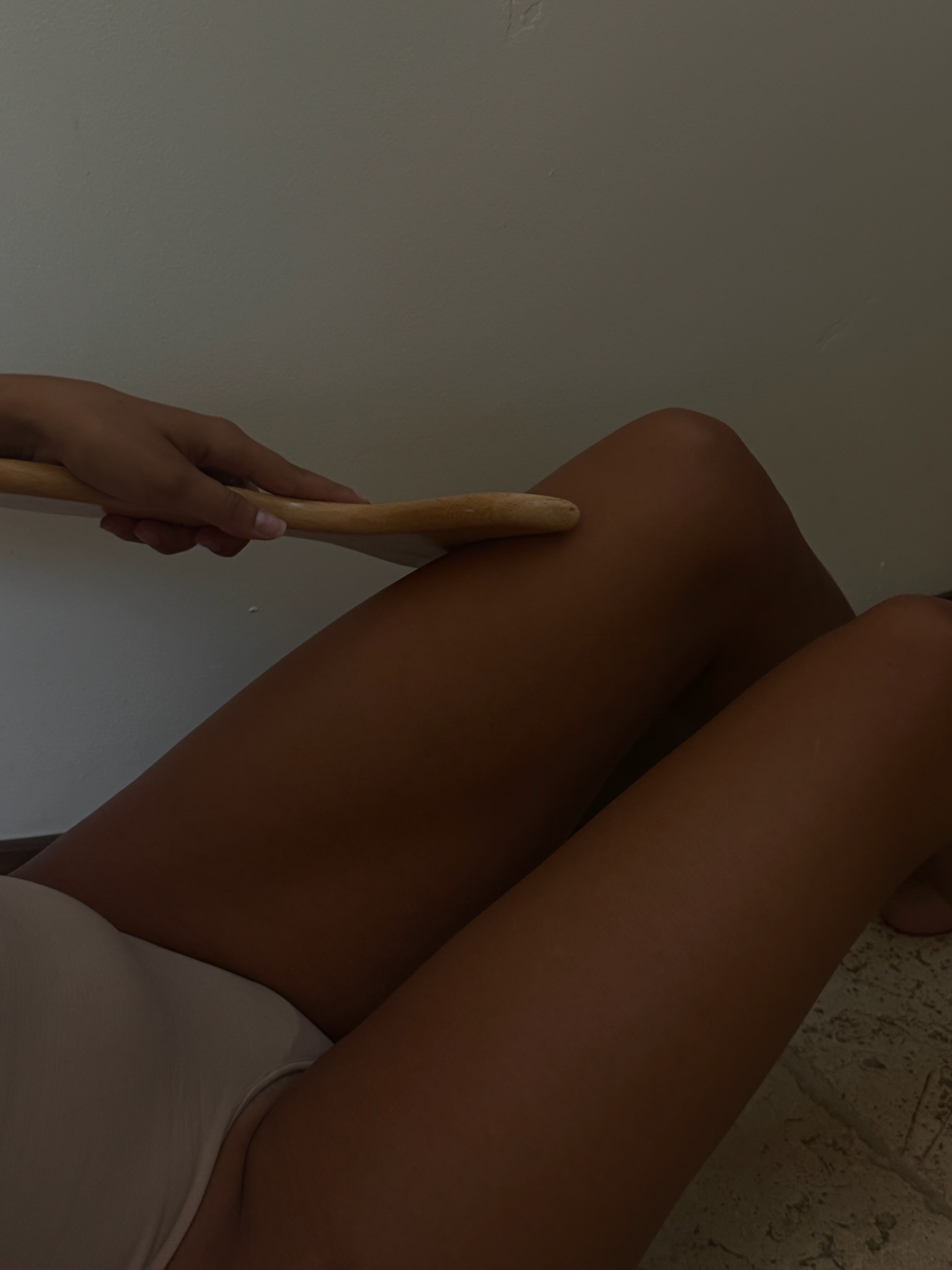
From there, we built out the full visual identity: a look sophisticated enough to match the treatments themselves, extended across business cards and brand photography that told the Cinchère story before a client ever stepped through the door.
From there, we built out the full visual identity: a look sophisticated enough to match the treatments themselves, extended across business cards and brand photography that told the Cinchère story before a client ever stepped through the door.
From there, we built out the full visual identity: a look sophisticated enough to match the treatments themselves, extended across business cards and brand photography that told the Cinchère story before a client ever stepped through the door.


"I cannot say enough good things about Lindsay and her team! They are incredibly talented, creative, and truly care about their clients. I’m so grateful to have found such an amazing team to help bring my vision to life. Highly recommend them! 🤍"
"I cannot say enough good things about Lindsay and her team! They are incredibly talented, creative, and truly care about their clients. I’m so grateful to have found such an amazing team to help bring my vision to life. Highly recommend them! 🤍"


The color palette followed the same tension as the name itself: bold and red, a color that speaks to confidence and transformation, softened by elegant bridal details that keep it feeling refined rather than aggressive. That same balance carried through to every touchpoint — including a custom business card and a one-of-a-kind menu, both designed to make her brand impossible to blend in with the rest of the industry.
The color palette followed the same tension as the name itself: bold and red, a color that speaks to confidence and transformation, softened by elegant bridal details that keep it feeling refined rather than aggressive. That same balance carried through to every touchpoint — including a custom business card and a one-of-a-kind menu, both designed to make her brand impossible to blend in with the rest of the industry.
The color palette followed the same tension as the name itself: bold and red, a color that speaks to confidence and transformation, softened by elegant bridal details that keep it feeling refined rather than aggressive. That same balance carried through to every touchpoint — including a custom business card and a one-of-a-kind menu, both designed to make her brand impossible to blend in with the rest of the industry.

With a name, identity, and visual foundation in place, we turned to strategy — mapping out collaborator partnerships, audience development, and a 30/60/90 day launch roadmap designed to position Cinchère as the obvious choice in Scottsdale from day one. What started as an idea is now a fully realized brand, built to compete and win in a premium market.
With a name, identity, and visual foundation in place, we turned to strategy — mapping out collaborator partnerships, audience development, and a 30/60/90 day launch roadmap designed to position Cinchère as the obvious choice in Scottsdale from day one. What started as an idea is now a fully realized brand, built to compete and win in a premium market.
With a name, identity, and visual foundation in place, we turned to strategy — mapping out collaborator partnerships, audience development, and a 30/60/90 day launch roadmap designed to position Cinchère as the obvious choice in Scottsdale from day one. What started as an idea is now a fully realized brand, built to compete and win in a premium market.
Photography
Photography
The brand shoot collection they can use across social, web, and every marketing touchpoint for the quarter to come.