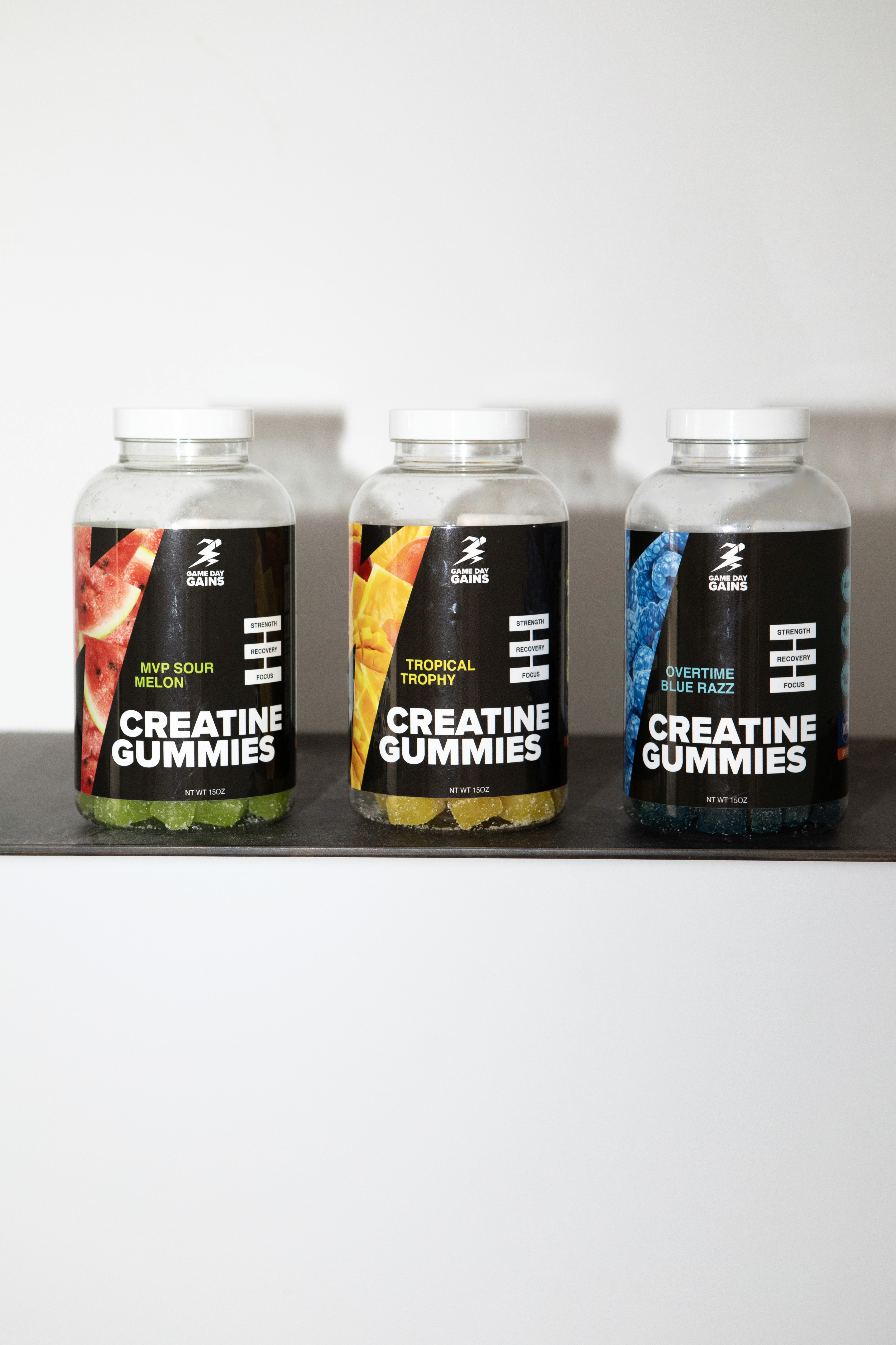
We started by rebuilding the foundation of the brand's visual identity, leaning into electric, bold colors designed to grab attention on shelf and speak directly to an athlete audience that responds to energy, intensity, and confidence.



Packaging prior to rebrand.

With that brand foundation in place, creative production followed. The design was originally built around pouches, but when the manufacturer couldn't deliver in time, we designed bottles as well, keeping the brand consistent across formats from day one.